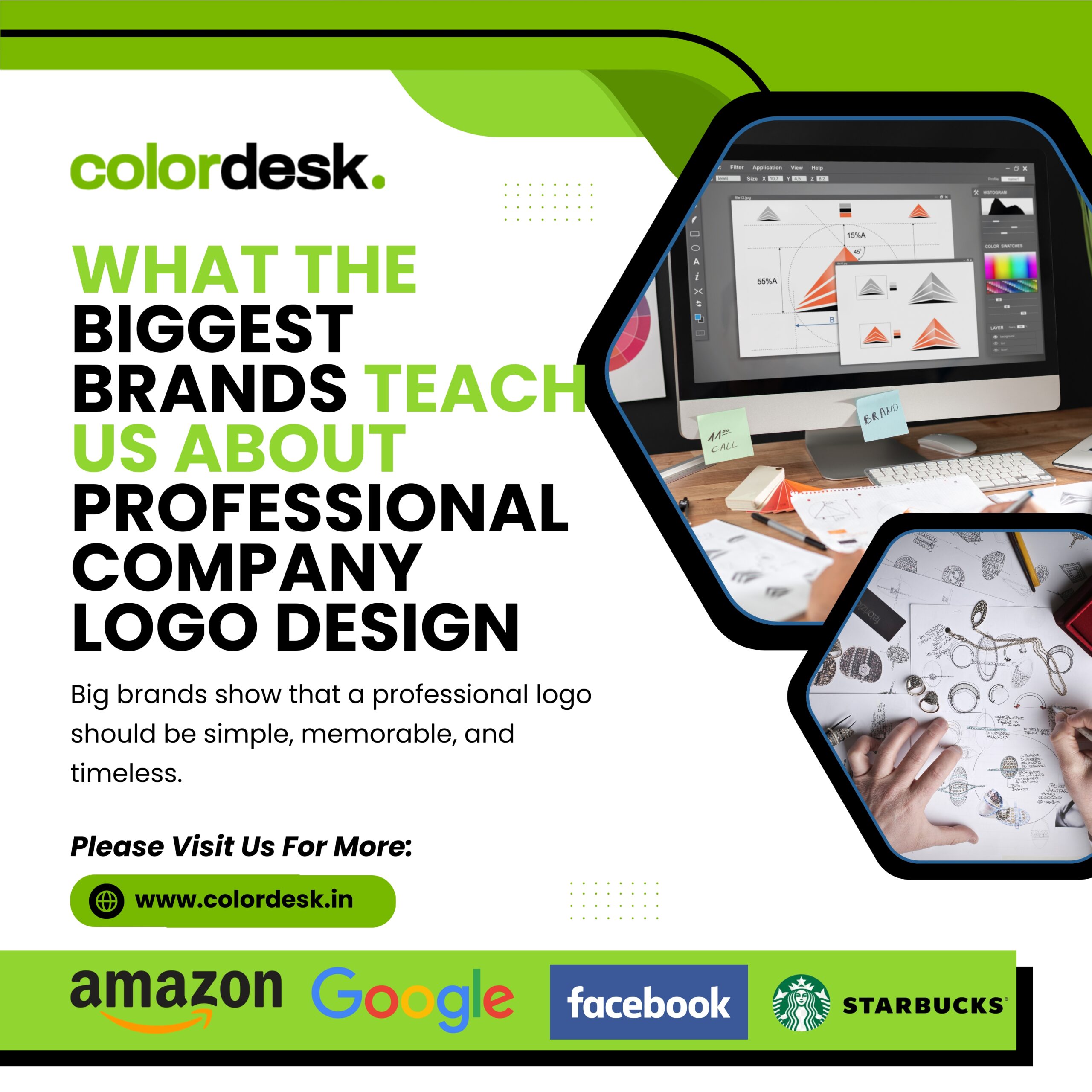
What the Biggest Brands Teach Us About Professional Company Logo Design
A logo is the face of a brand, and it plays an important role in creating trust and brand identity. This is the first thing that customers identify and that is the way People always say – “First Impression is the Last Impression”. When we think of reputed logos and brands, what comes first in our mind – Amazon, Facebook, Starbucks, Google – Yes!. These companies have mastered the art of the logo design of professional companies, making their logos visually attractive and powerful brand property.
Do you know why these logos are getting huge popularity and what makes them stand out? Let’s explore the key points of professional logo design for a company.
1. Amazon Logo: Simplicity with a Hidden Message
The Amazon logo is one of the most popular and recognizable in the world. At first glance, it looks like simple typography, but it’s more than what we show.
Key Elements of the Amazon Logo:
Smile from A to Z: In Amazon people, the arrow stretches from the letter “A” to “Z”, showing that the company provides everything from A to Z.
Friendly and acceptable: curved arrows resemble a smile, which gives more welcome to the brand.
Color Psychology: The black and orange combination conveys professionalism and energy.
Lesson from Amazon’s Logo:
A professional company logo design should be simple yet meaningful. Hidden elements can make a logo more memorable and create an emotional relationship with customers.
2. Facebook logo: The Power of Minimalism
There have been subtle changes in Facebook logo over the years, but it has always maintained its minimum approach.
Major elements of the Facebook logo:
Simple typography: Lowercase “F” is immediately recognizable.
Communion Rang Yojana: Facebook has been stuck in blue since its inception because it represents confidence and reliability.
Adaptability: The Facebook logo works well in different formats, whether it is a full Wordmark or a standalone “F” icon.
Lesson from Facebook logo:
The logo design of a successful professional company should not be complicated. Simplicity and stability ensure that your logo remains timeless and effective in various mediums.
3. Starbucks logo: A Story of Evolution
Starbucks logo is one of the most prestigious people in the food and beverage industry. Over the years, it has developed quite a great, but it has always maintained its main identity.
Major elements of the Starbucks logo:
Symbolism: Marmeda (Siren) represents the brand’s connection to the sea, as Starbucks was named after a character in Mobi-Dik.
Green color psychology: Green is a symbol of growth, freshness, and stability.
There is no need for any Wordmark: Starbucks dropped the lesson from its logo, which proved that a strong view identity could stand alone.
Lesson from the Starbucks logo:
The logo design of a professional company should tell a story. If your brand has a deep meaning, it makes it more attractive and unique to include it in the logo.
4. Google logo: playful yet professional
The Google logo is lively and playful while maintaining a professional form. It has passed through many purifications, but always sticks to its main visual identity.
Major elements of the Google logo:
Multicolor palette: The use of primary colors (blue, red, yellow) with green signals symbolizes the creativity and innovation of Google.
Custom Font: The logo uses a simple, SANS-Serif typeface which is both modern and readable.
Flexibility: Google often modifies its logo with fun doodles, while maintaining its main design.
Lesson from Google’s logo:
The logo design of a professional company can be fickle, yet maintain credibility. Using colors strategically can help express the personality of a brand.
Key Takeaways for Your Logo Design
Keep It Simple Yet Meaningful – The best logos are often the simplest ones. Look at the Amazon logo and how it conveys a message subtly.
Choose the Right Colors – Colors have psychological effects. The Facebook logo proves that blue builds trust, while the Starbucks logo uses green to promote sustainability.
Make It Adaptable – Your logo should work well in all formats, just like the Facebook logo and Google logo do.
Tell a Story – A unique backstory, like the Starbucks logo with its siren, adds more depth to a brand’s identity.
Ensure Timelessness – Google, Amazon, and Facebook have made minor updates but retained their core essence, proving the importance of longevity in design.
Conclusion: Now It’s Your Turn to Create an Iconic Logo!
A well-designed logo is a powerful branding tool that can make or break a company’s identity. Whether you are designing a new logo or refining an existing one, taking inspiration from Amazon, Facebook, Starbucks, and Google logos, Colordesk help to create professional company logo designs that stand out.
By focusing on simplicity, color psychology, adaptability, story, and timelessness, your brand can build a logo that leaves a permanent impression.
Need a professional company logo design? Be inspired by the biggest brands and make something iconic for your business today!
FAQs – Frequently Ask Questions
- Why is logo important for a company?
A logo is the face of a brand, which helps establish trust, recognition and a strong brand identity. This creates a permanent first impression on customers.
- Is a professional logo standing out?
A great logo is simple, memorable, adaptable, timeless and meaningful. It uses strategic colors, typography and design elements to express the message of a brand.
- What is the meaning hidden behind the people of Amazon?
The logo of Amazon has a smile -shaped arrow from A to Z, which symbolizes customer satisfaction and vast category products.
- Why does Facebook logo use blue color?
Facebook chose Neela because it represents faith, reliability and professionalism, making it a powerful option for social media platforms.
- What makes Starbucks logo unique?
Starbucks logo is a siren (marmade), which represents a deeper root connection of the brand for sea and global coffee culture.
- How does Google’s logo reflect their brand identity?
The multicolored logo of Google is a symbol of creativity, innovation and fickleness while maintaining a professional and modern form with a SANS-Serif font.


